
A fundamental component of Power BI is Reports, which offer visuals that provide in-depth insights from data. However, with more visuals, reports can become messy. That’s where filters in Power BI come in. This article will explore a special filter called Slicer to make better-looking reports.
Click to skip down to a specific section:
What Are Slicers?
A slicer is a visual element that filters other visuals on a report page. In Power BI reports, you'll find various types of slicers. Users can leverage slicers to sort and filter a report, displaying only the information they are interested in.
Unlike traditional filters, slicers are visually integrated into the report, allowing users to select values directly during analysis. The following are the reasons to consider a slicer:
- Displaying commonly used or important filters directly on the report canvas for easy access.
- Clearly showing the current filtered state without opening a drop-down list.
- Filtering by columns that are unnecessary and hidden in the data tables.
- Creating more focused reports by placing slicers next to key visuals.
Better-Looking Reports with Slicers
In this section, we will use a sample case study and implement the different types of slicers in Power BI. The sample is a report on customer profitability. Download the report* and follow the instructions to create your first slicer to get started.
*NOTE: If the hyperlink above doesn't work, simply copy and paste the following link into your browser and hit enter; your download should start:
https://download.microsoft.com/download/6/A/9/6A93FD6E-CBA5-40BD-B42E-4DCAE8CDD059/Customer%20Profitability%20Sample%20PBIX.pbix
Create a Slicer
Once the report is downloaded, do the following to create the first slicer:
- Open Power BI Desktop, go to the menu bar, then select File > Open report.
- Locate and open the .pbix file.

- Click the Report icon in the left pane to switch to Report view. By default, it is switched to Report view.
- On the Overview page, with no items selected on the report canvas, click the Slicer icon in the Visualizations pane to add a new slicer.

We can already see some slicers in the report. We will also create ours to enhance its readability.
Types of Slicers
In this section, we will discuss different types of slicers and show how to create them in the sample report.
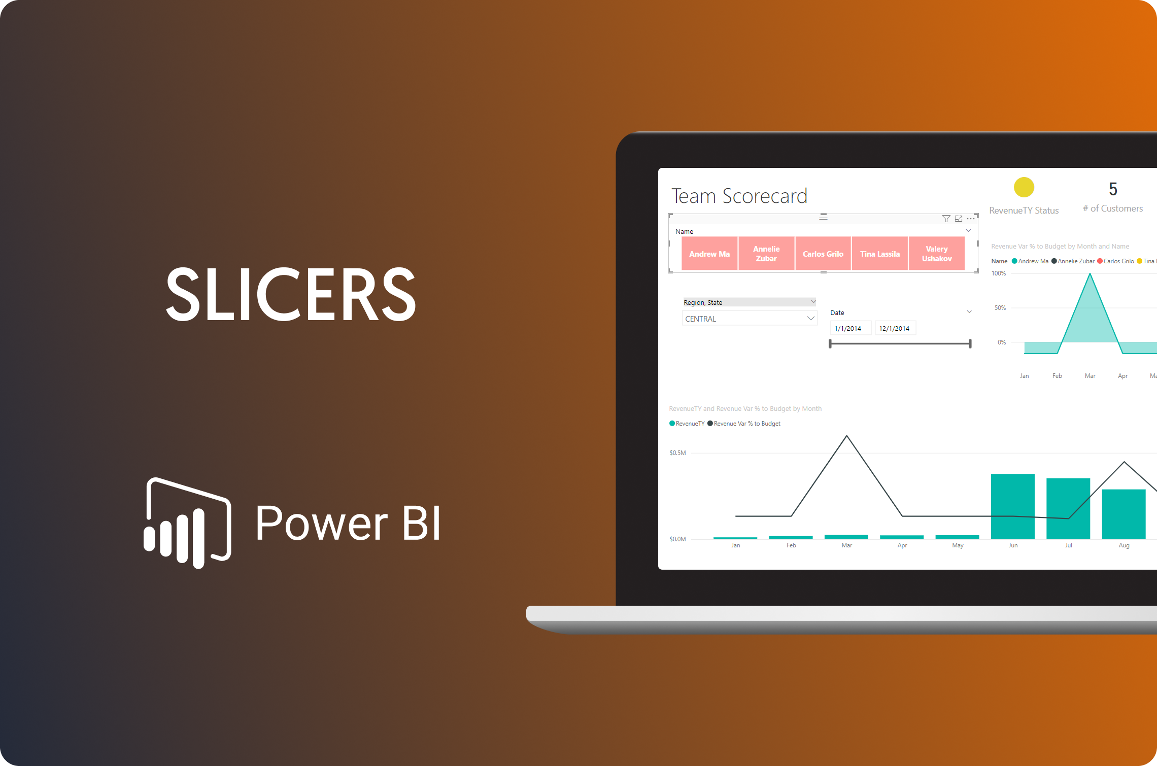
Button Slicer
Buttons are a way to slice data on touchscreen devices, such as tablets and cell phones. Their ease of selection and deselection makes this type of slicer highly popular.
In the report, we want to see the revenue generated by each executive. Let’s create a button slicer for it step by step:
- Create a slicer as mentioned above. Adjust the dimensions of the slicer box accordingly.
.png?width=2081&height=1039&name=Slicers%20image%203%20(1).png)
- Now, we need to assign a column to the slicer. To review the revenue generated by each executive, assign the slicer to the Name column in the Executive table.

- To change the default format to buttons, navigate to Visualizations > Format Visual > Slicer Settings > Options > Style and set the style to Tile.

As we can see in the screenshot above, it only shows the revenue of the selected item.
List and Hierarchy Slicer
The default style for the slicer is a List. Previously, we saw the revenue generated by each executive. Now, let’s do it region-wise as well. Here are the steps:
- Create a slicer just like before and adjust the dimensions of the slicer accordingly.

- Next, we need to assign columns to the slicer. To view the revenue generated by each executive and by region, assign the slicer the Region column from the State table.

- We see "(blank)" in the category because some rows miss customer region information. We can exclude it by selecting the category, right-clicking to access the menu, and clicking Exclude.

- Let’s go one step further and include the region's states. We can easily extend the List Slicer to a Hierarchy one. Drag the state field from the data and drop in the visualization field, or simply select the state field as shown below:

Dropdown Slicer
If space is limited or you prefer a single-select option, you can convert the Slicer into a dropdown list that minimizes after a selection is made. Let's apply this to the region and state slicers:
- Select the slicer and navigate to Slicer Settings > Options > Style.
- Next, choose the dropdown option.

Timeline Slicer
Timeline slicers filter visuals based on date ranges, allowing you to filter data greater than or less than a set date, between two dates, relative to a date and time window, etc. When adding a slicer with a Date field, Power BI defaults to a Range Slicer with start and end date options. Let's create a slicer in the report to view revenue by date.
- Create a slicer just like before and adjust the dimensions of the slicer accordingly.
- This time, assign the column Date to create a Timeline slicer.

- Users can adjust the start and end date controls to see the changes. The range slicer can be configured similarly, with the only requirement being that the column must be numeric.
Sync Slicers Between Report Pages
It's often desirable to make slicer selections on one page and apply them to other pages. This saves time and eliminates the need to recreate the same slicer on multiple pages.
To sync slicers across report pages, activate the Sync Slicers pane by selecting View > Show Panes > Sync Slicers.

With a Power BI Slicer selected, this panel displays a list of all report pages, featuring two control columns for each page: sync and visible control. Checking or unchecking a sync control for a page enables or disables synchronization between the slicer and its copies on other pages. Checking or unchecking a visible control shows or hides the slicer on other pages.

With this configuration, the slicers will be visible on the selected pages and synced across them.
Benefits & Limitations of Slicers
Slicers are not a one-size-fits-all solution for every data filtering issue. Here are their benefits and limitations:
Benefits
- User-Friendly Interface: Slicers are visually intuitive and easy for users to interact with. This makes them ideal for quick filtering on report pages.
- Enhanced Visibility: Positioned prominently on the report canvas, slicers ensure important filters are always accessible, improving user experience.
- Flexibility: Users can easily select values during analysis, making slicers versatile for various report designs.
Limitations
- No Visual Filtering: Visual filters are not supported. This limits their use in complex filtering scenarios.
- Time Zone Handling: The slicer Data models lack time zone information, though the Query Editor adjusts local time.
- Aggregation Limitations: Numerical slicers cannot process aggregated values or support measurements. They filter only raw data.
Get All Your Data to Power BI Using Dataddo, for Free
Dataddo is a no-code tool that can sync data from cloud services to dashboarding apps like Power BI. Easily connect all your services to Power BI, so that your data automatically refreshes weekly, daily, hourly, or even more frequently!
Worried about broken dashboards? Don't be. We proactively monitor and maintain all connections, so that they won't break in the middle of the night.
Worried it's going to be too expensive? We offer a free plan that enables connection of any cloud service to Power BI.
We also offer a huge portfolio of connectors, as well as universal connectors; if you don't see the one you need, we can build it for you in around 10 business days. This means that you'll always be able to connect all your services to your dashboards.
Watch this quick video to see how the Dataddo platform works.
To learn more about using Dataddo to sync data to Power BI from online services, databases, or other apps, check out our data integration products.
Or sign up for a free Dataddo account to start syncing data to Power BI right away!
Additional Power BI Tips and Tricks
Keep reading the Dataddo blog for more Power BI tips, tricks, and resources!
- Facebook Ads Dashboard Using Dataddo and Power BI
- Mastering DAX Functions in Power BI
- Guide To M Code in Power BI: A Power Query Formula Language
- Smarter Financial Dashboards for SMEs (with Free Power BI Template)
- Overcome Data Blending Limitations of Tableau, Looker, Power BI
- How to Connect NetSuite to Power BI: ODBC vs. Dataddo
- How to Connect Google Sheets with Power BI: Direct vs. Dataddo
- How to Connect Sage Accounting to Power BI for FREE: Direct vs. Dataddo
- How to Connect Google Analytics to Power BI for FREE: Direct vs. Dataddo
- How to connect JSON with Power BI: Direct vs. Dataddo
- How to Connect SEMrush to Power BI for FREE
- Connecting Xero to Power BI: Native or Third-Party Connector?
|
Connect All Your Data with Dataddo Just a few quick steps to get your data to Power BI.
|


Comments