
Microsoft Power BI is a data visualization platform used primarily for business intelligence purposes. It lets you combine data from various sources, visualize and discover what's important, and share the results with anyone you want. Its key features include:
- Data cleansing and transformation: Users can clean and transform data to ensure its accuracy and usability.
- Building data models: Enables the construction of robust data models to support analysis.
- Creating dashboards and reports: Enables effective visualization and communication of data.
In this article, we will go through the steps of building a template dashboard for Facebook Ads in Power BI, using data funneled by Dataddo—a free data integration and automation tool that connects analytics tools to business intelligence apps and storages. The article will also cover the steps of connecting Facebook Ads to Power BI. Let’s get started.
Click to skip down to a specific section:
- What is a dashboard in Power BI?
- Connecting Facebook Ads to Power BI with Dataddo
- Creating a dashboard in Power BI
- Additional Power BI tips, tricks, and templates
What Is a Dashboard in Power BI?
A Power BI dashboard is a single page, often called a canvas, that conveys a story through visualizations. Due to its single-page format, a well-crafted dashboard features only the key points of that story.

Many beginners find it challenging to distinguish between dashboards and reports. Dashboards are limited to one page and cannot be filtered or sliced, while reports can span multiple pages and offer extensive filtering, highlighting, and slicing options. However, dashboards can integrate data from multiple reports and semantic models, whereas reports are based on a single semantic model.
Advantages of Dashboards in Power BI
- Dashboards are a tool to monitor your business, displaying all your most important metrics at a glance.
- The visualizations on a dashboard can originate from one or multiple underlying semantic models and reports.
- A dashboard integrates on-premises and cloud data, offering a consolidated view.
- A dashboard is not merely a visual display; it is highly interactive, with tiles that update as the underlying data gets refreshed (with Dataddo, refreshes happen automatically).
Now that we understand what a dashboard is, let's make one for Facebook Ads. We'll start by connecting our Facebook Ads data with Dataddo.
Connect Facebook Ads to Power BI with Dataddo
Dataddo is a no-code data integration tool that can transfer data from any source to any destination, including Power BI. And it's really easy to use, as you'll see below.
If you don't already have an account, go to Dataddo.com and create an account for free by clicking Login.

After you log in, you'll see a screen like this:

Now, let's connect Facebook Ads to Power BI.
Connecting Facebook Ads with Dataddo
This section is divided into three simple parts. Let’s go over them one by one.
Create a Source
- From the Dataddo homepage, go to Sources and click on Create Source.

- Then search for Facebook Ads and select it.

- After selecting Facebook Ads, authorize your Facebook account to connect to your data.

- Select the attributes and metrics needed for your use case.

- After reviewing the advanced settings, which are usually left untouched, you can test your data if you want. Then click Save.

Now that our source data is ready, let’s create our destination.
Create a Destination
- To create the destination, go to Destination and search for Power BI as shown below:

- Click on the Power BI connector and your flow will be complete.
Connect Your Facebook Ads Data to Power BI
Once your flow is complete, a popup will appear in the Dataddo platform with some simple instructions on how to connect your data to Power BI.
If you get stuck, refer to the steps in our documentation on Power BI.
Now that you've connected your data to Power BI, it’s time to create visuals for our dashboard.
Creating a Dashboard in Power BI
This section will be divided into two parts:
- Creating visuals of clicks, CTRs, & impressions
- Creating visuals of conversion rate & cost
Let’s dive in.
Visuals of Clicks, CTRs, & Impressions
Clicks, impressions, and click-through rates (CTR) are key metrics for evaluating the performance of online marketing campaigns:
- Clicks: The number of user interactions with an ad or link.
- Impressions: The number of times an ad or link is displayed to users.
- CTR (Click-Through Rate): A percentage representing the ratio of clicks to impressions, calculated by dividing the number of clicks by the number of impressions and then multiplying by 100. For instance, an ad with ten clicks and 100 impressions has a CTR of 10%.
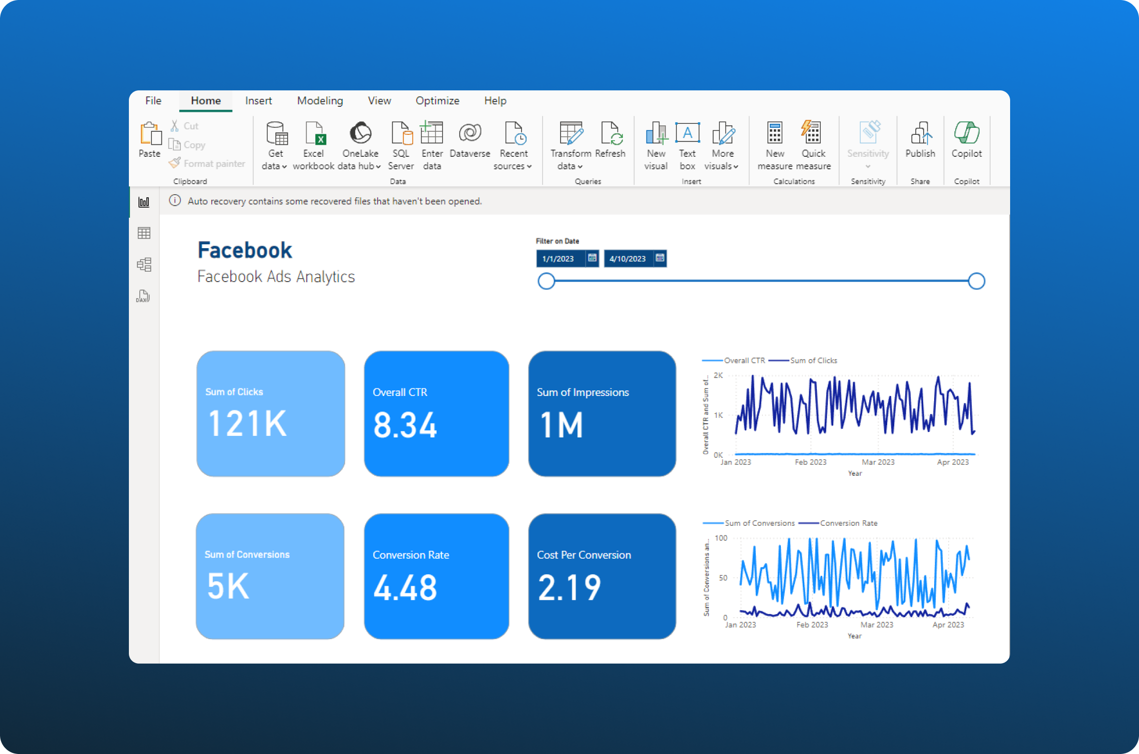
We'll create three cards in Power BI to display total clicks, total impressions, and CTR. Following that, we'll construct a line chart to show clicks and CTR over time.
Total Clicks
The total clicks for an advertisement provide quick insight into sales. The card visual in Power BI is useful for displaying metrics like total sales and total count. Here’s what we need to do:
- The first step is to click the card visual in the Visualization section.

- After selecting the card visual, adjust where you want it to be and then select the Clicks column from the dataset as shown below:

- After selecting, it will be displayed on the card as follows:

Total Impressions
The steps for total impressions are similar, but this time, the column will be impressions instead of clicks. Here’s how it will look after adding the total impressions:

CTR
To display CTR on the card, we need to sum the clicks and impressions, divide the total clicks by total impressions, and then multiply by 100. This will require us to create a new measure. Let’s see that step-by-step:
- First, create a measure by going to the Modeling tab and clicking on New measure.

- After creating the measure, write the following DAX formula to fetch the sum of clicks (you can learn more about DAX formulas here):
Total Clicks = SUM('dataset'[Clicks])Like so:

- Finally, a new measure named Total Clicks has been added to the columns.

- The measure for total impressions can be generated similarly.

- Finally, we can create the CTR metric by using the following DAX script:
Overall CTR = DIVIDE([Total Clicks], [Total Impressions], 0) * 100
This creates the Overall CTR measure as shown below:
- Let’s add the card now and see the result.

Line Chart for Clicks and CTR Over Time
Here are the steps to create the line chart showing clicks and CTR over time, which provides insights on interest over impressions.
- First, click the line chart icon located in the visual section as seen below:

- Choose the data columns for the visuals: clicks, CTR, and date. This is what the visual looks like:

Now let's talk about conversion rates and cost.
Visuals of Conversion Rate & Cost
A conversion rate records the percentage of users who have completed a desired action. Cost per conversion (also known as cost per acquisition or CPA) measures the cost of acquiring one conversion. These are important metrics for judging an ad campaign.
We will create three cards in Power BI to display conversions, conversion rates, and conversion costs. Then, we'll construct a line chart to show conversions and conversion costs over time.
Note: Since the steps will repeat, we will only discuss the steps that have changed.
Conversions
To display the conversions:
- Click on the card in the Visualizations section and choose the conversions data in the dataset. After selecting, it will appear like this:

Conversion Rates
Here’s how to display the conversion rate in the dashboard:
- Create a measure by clicking the Modelling tab and clicking the New Measure. Write the following DAX formula:
Conversion Rate = DIVIDE(SUM('dataset'[Conversions]), SUM('dataset'[Clicks]), 0) * 100The formula here is condensed because it does not create any extra measure like before. Here is the result:

- Create a Card and check the conversion rate measure.

Cost/Conversion
For this, we need to:
- First, create the measure by following the same steps and writing the following DAX formula for it:
Cost Per Conversion = DIVIDE(SUM('dataset'[Spend]), SUM('dataset'[Conversions]), 0) - After that, select the card and check the newly created cost per conversion.

Line Chart for Conversions and Conversion Rate Over Time
Here are the steps to create a line chart showing conversions and conversion rates over time:
- Select the line chart in the visuals in Power BI.

- After that, select Conversions, Conversion Rate, and Date in the same order. Here’s the result:

Now that we have completed the main part of the project, let’s add some nice touches to the dashboard.
Adding a Slicer
A slicer is a visual element that filters the other visuals on a report page. When using Power BI reports, you'll find various types of slicers (learn more about slicers here). In this dashboard, we will filter the data by date. Here's how to do it:
- Select the Slicer icon in the Visualizations section.

- Select the date column to create a slicer that filters based on the date.

Now, we can filter our dashboard by date to create a nicer look.
Final Touches
In this section, we will enhance the dashboard's visual appeal by adding a title, adjusting color schemes, and refining the overall design. These improvements will ensure the dashboard is informative and visually engaging for the audience.
- We can add a title to the dashboard by clicking on the text box.

- We can make it look lively by changing the color scheme of the cards in the dashboard. Click on the card and go to Format Visuals in the right section:

- Now, change the style settings. Here’s how it looks now:

Adjustments to the background and text colors have significantly enhanced the dashboard's aesthetics.
Wrapping Up: Streamlining Facebook Reports with Dataddo and Power BI
Analytics of online ads are so important for marketing teams to be able to validate their processes. However, keeping data updated and accurate is a time-consuming challenge.
Dataddo solves these problems by syncing analytics-ready data to Power BI at the intervals of your choice. And not just from Facebook Ads, but from all your other online sources.
It also includes built-in tools for data quality control, data blending, data security (like the ability to exclude personally identifiable information), and storage (eliminating the need for a separate data warehouse).
Sign up for a free Dataddo account now and get your data flowing to Power BI in minutes 👇
|
Connect All Your Data with Dataddo Just a few quick steps to get your data to Power BI.
|

Additional Power BI Tips, Tricks, and Templates
Continue reading the Dataddo blog for more Power BI tips, tricks, and templates!
- Full Collection of Expert Tips, Tricks, and Templates for Power BI
- Smarter Financial Dashboards for SMEs (with Free Power BI Template)
- Guide to Slicers in Power BI: Create Better-Looking Reports
- Guide To M Code in Power BI: A Power Query Formula Language
- Mastering DAX Functions in Power BI
- Overcome Data Blending Limitations of Tableau, Looker, Power BI
- How to Connect NetSuite to Power BI: ODBC vs. Dataddo
- How to Connect Google Sheets with Power BI: Direct vs. Dataddo
- How to Connect Google Analytics to Power BI for FREE: Direct vs. Dataddo
- How to Connect SEMrush to Power BI for FREE

Comments